Marketing and advertising can take advantage of countless media in the modern world. And with consumers using technology for almost everything, there’s never been a better time to provide them with customized marketing materials designed to cater to their interests. While there are several ways to do this, one popular choice for most companies is to send an email.
But any marketer knows that there’s more involved than just typing a couple of lines of text and clicking send. Effective marketing emails need engaging content, eye-catching colors, an aesthetically pleasing design, and more to bring in business. And don’t forget about customizing the email’s content to match the customer’s interests! Marketing automation tools like Oracle Eloqua can help you create successful emails, but they won’t do all the work for you.

Your End Goal: Generating Conversions
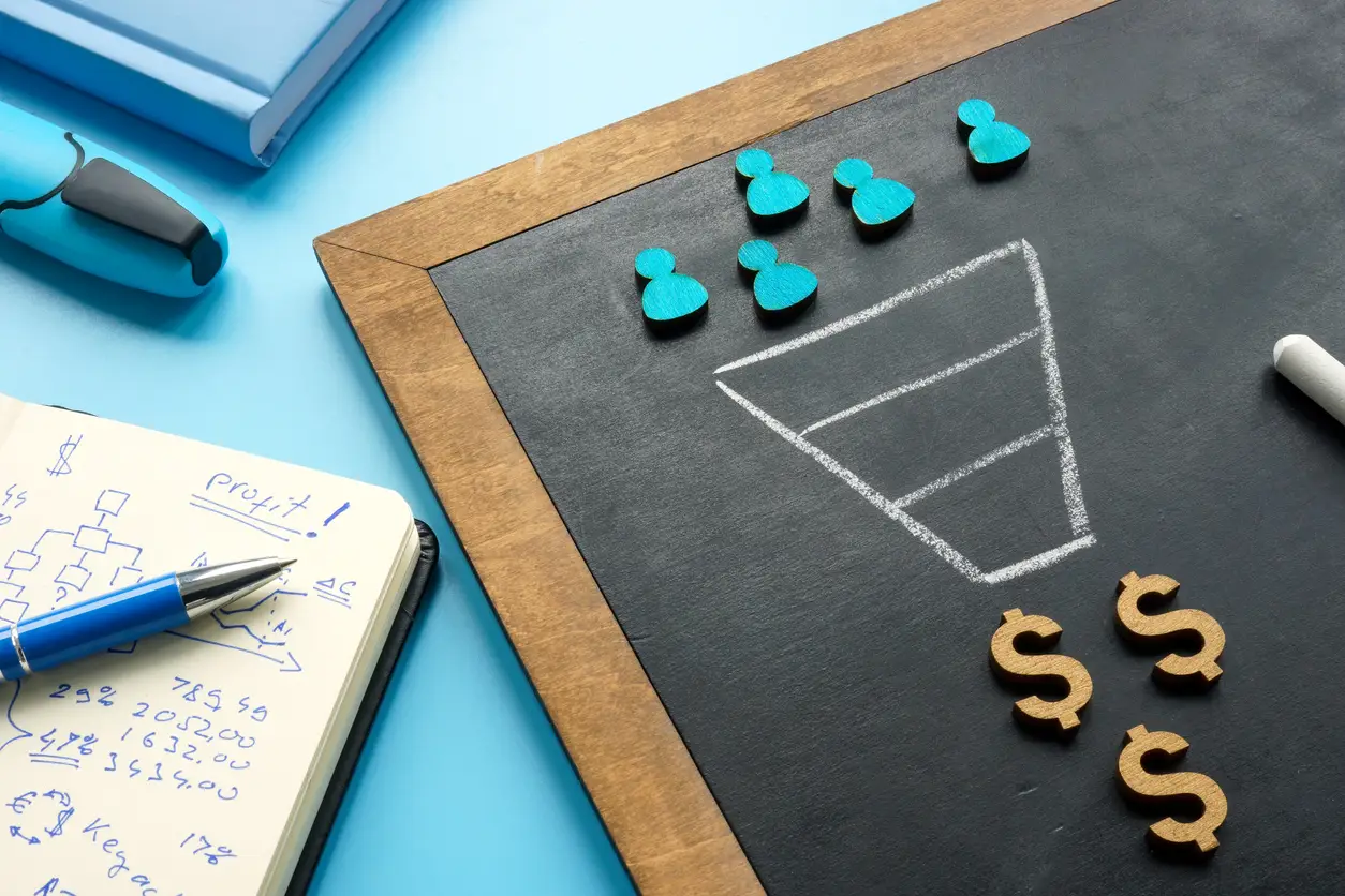
As you begin designing and writing your emails for the campaign, keep your end goal in mind: generating conversions. This goal should influence each step of the process. What is your email offering the customer? Does it meet their needs? Will they be satisfied with the offer? Your customers’ thought process should be at the forefront of your campaign plans.
With this goal in mind, let’s take a look at how to design emails for effective marketing.
The 6 Types of Marketing Emails
Businesses focused on eCommerce should focus on six key types of marketing emails to retain or boost customer engagement. These emails include:
- Welcome emails shortly after subscription
- Promotional or announcement emails about a new product or upcoming event
- Receipt emails sent to confirm an order
- Re-engagement emails to revive interest in inactive customers
- Newsletter emails to keep customers engaged and updated
- Cart abandonment emails to remind customers about an unfinished online transaction
Each email demands its own layout and design. Since the type of email determines the design you’ll be creating, knowing what type of email you’re creating is a critical first step.
How to Design Emails: Aesthetics
There are a few key elements to keep in mind as you design your email layout. First of all, consider how this email is likely to be viewed. Do your customers tend to open emails on a phone or on a laptop? Your final design should be mobile-friendly and still look good on a larger screen.
Second, branding. Is your logo and/or company name prominently displayed? Can the customer tell at a glance which company is contacting them?
Third, colors. Too many colors can create an email so bright it’s painful to look at and may even slow down the loading time. Overly busy patterns can cause similar problems. On the other hand, not enough colors can make your email look stale and boring. Find a balance of colors that will catch the eye without overwhelming your reader. And most importantly, keep your colors consistent with your brand! Using hot pink in an email when your logo is dark blue isn’t a great idea.
Finally, consider white space. It shouldn’t take up your entire email. Instead, use white space strategically to distinguish between different sections of your message. This will help the email flow. You can also use white space to highlight important sections, such as your CTA button.
Making a Great First Impression
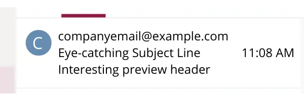
Before a customer clicks on your email, two all-important lines of text are displayed in their inbox: the subject line and the preview header. Both have an important role to play in customer engagement.

The subject line is the first part of an email the recipient will see. It has to be intriguing! A subject line that’s too long will make a customer lose interest and, worse yet, may even be cut off since most email inboxes restrict subject lines to 60 characters. Some mobile devices even cap the limit at 30 characters! Keep it short and sweet without sacrificing the all-important intrigue.
Next is the preview header. This is a line or two of text below the subject line that adds a little more detail about the contents of the email. This should be close to your subject line length, with a standard upper limit of 40-50 characters. Put the most important ideas first just in case your preview header is cut off. But don’t give it all away here! Make the customer interested enough to click on the email instead of getting all the info they need from the preview.
Additionally, make sure to add something for the preview header even if it’s short. If you leave the space blank, your client’s inbox will display the first line or two of your email body instead. It’s far better (and cleaner-looking) to add a short, snappy preview header.
Personalizing the Message
Emails that are timely, relevant, and personalized can significantly increase the chance of a customer responding. Addressing the recipient by name is already a great start, but don’t stop there. Further data segmentation allows you to create emails designed specifically to make the customer happy and more likely to buy. To use an example, segmentation should prevent you from sending an email promoting a new brand of cat food to someone who owns a dog and has no use for cat food.
Eloqua users will be happy to know that Eloqua’s custom objects system allows you to segment and personalize emails like a pro! Learn more about how to use custom objects in email design here.
What to Write?
It’s finally time to draft your email. But what does it take to create the perfect email copy?
There are a few principles to keep in mind as you write your email body. First and foremost, keep it simple. Invite your readers to click on landing page links for more details instead of trying to fit all those details into your email. Short, to-the-point email copy will leave a much bigger impression on your readers than trying to write an entire essay.
Second, remember to humanize your content. This goes beyond personalization measures like inserting the reader’s first name. If your email sounds like a robot wrote it, people will get bored and click off. Make the email feel like it was written specifically for them.
Third, consider whether your email works better as active or passive content. (A quick refresher: active content invites the reader to do something, such as make a purchase or register for an event. Passive content, such as a white paper or infographic, simply presents information without asking the user for action in return.) The vast majority of marketing emails should consist of active content.

Technical Considerations
Now that you have your email drafted, it’s time to start designing. But there’s more to keep in mind at this stage than just graphic design principles. A well-designed email that doesn’t function correctly is a failed email. As you design your message, prioritize these technical considerations:
- Links: Double and triple check that each link works and sends you to the correct webpage or asset
- Fallback fonts: Sometimes your branded font may not load properly in a client’s inbox. When this happens, the inbox will load your email in a default font instead. Choosing a fallback font allows you to control what this default font will look like without compromising your email design.
- Email dimensions: It’s generally advised to stick to a width of 600 px for desktop emails, and 320 px for mobile. Remember to check your final email in both desktop and mobile inboxes to ensure the design changes to fit your screen.
- File size: There’s no ideal file size for your finished email or the assets you use in it. However, remember that the bigger your email is, the longer it will take to load, especially on mobile. Experiment to find a good balance between eye-catching visuals and a shortened loading time.
- Alt text for images: On hopefully rare occasions, an image in your email will fail to load properly. The recipient will see a blank white space when this happens. However, if you add alt text to your image, this white space will display the alt text if the image fails to load. Adding alt text that flows well with the rest of your message, and describes the missing image, makes the email feel more complete even if something goes wrong.
The All-Important CTA Button
Your email might have multiple CTA links, but only one should take the spotlight and be the primary focus of your email. This one links to the action you really want to encourage: making a purchase, downloading a document, registering for an event, etc. Your primary CTA should be separate from the rest of the message, ideally in a colorful button surrounded by white space to make it stand out. Keep the copy short and sweet—“Shop now” will work far better than “Browse these amazing deals and more in our online store”.

Overall, your CTA button should clearly explain what you want the customer to do, stand out in your email message, and make the customer interested enough to click.
Don’t Forget the Footer
Once the rest of your email is done, start thinking about the potentially most boring part that few customers pay attention to in the footer. Don’t overlook this even if you suspect your customers will. Not only can you use the footer to build additional connections, but it can also play a key role in your legal compliance.
A well-crafted email footer should contain several things:
- Reinforcement of your branding to make it absolutely clear who sent the email
- Contact and/or subscription information required by law (for instance, the address or contact info of your company, subscription management options, and possibly terms and conditions)
- Additional links (for example, links to contact your company or visit your social media pages)
- Privacy policy or a link to view it to show your commitment to privacy compliance
The email footer is your last chance to include vital content. Make sure to take full advantage of this.
Taking the Email for a Test Drive
Now it’s time to test the email!
There are three major things you should test for at this stage. First, see if everything loads correctly. When you open the email in your own inbox, are all the images showing up? Is the text formatting still good? Do all the links still work?
Second, perform a quick spam test. Sometimes you can accidentally trigger someone’s spam filter, get routed to their junk folder, and pass under their radar completely. See if your own inbox flags your email as spam. There are plenty of free and commercial spam checkers available online. Make any changes you need to pass the test.
Finally, it’s time to send the email out. This is where the third, more long-term focused testing stage comes in: A/B testing. You might have multiple subject lines or email layouts for a particular campaign and aren’t sure which one is the better choice. Send out both! Monitor your results to see which option performs better, and take this information into account when you design future campaigns.
Email Campaigns Take Time
When it comes to marketing email campaigns, quantity no longer determines the winner. In fact, sending out emails en masse can get you flagged as spam by some inboxes. Quality rules now. A professional marketing email designed to provide the customer with exactly what they want will be far more successful than the mass email campaigns of the past.
Ready to start designing better marketing emails? Get in touch with us today to learn more about how Oracle Eloqua can help.

