






Key Takeaways
- Responsive email design keeps layouts readable on every device.
- Eloqua and Marketo both build responsive emails without code.
- Gradients and background images break in Outlook and Gmail.
- Bulletproof buttons stay clickable when images fail to load.
- Mobile-responsive marketing emails need single columns and large tap targets.
- Email QA is the step that confirms everything renders correctly.
Table of Contents
Responsive email design is the difference between a message that looks sharp on a laptop and one that survives the majority of opens that now happen on a phone. Marketing operations teams working in Oracle Eloqua and Adobe Marketo Engage build polished emails every day, and both platforms promise mobile-friendly output straight out of the box.
But “looks fine in the preview” and “renders correctly in every inbox” are two very different promises. The moment you add a gradient, a background image, or a custom button, Outlook, Gmail, and Apple Mail start disagreeing about how your email should look. The layout you approved on your desktop quietly falls apart in the exact inboxes where your buyers are reading.
This is the practitioner’s map to responsive email design across both platforms. It covers what responsive really means, how Eloqua and Marketo each handle it, where bulletproof techniques earn their name, and why quality assurance is the step that decides whether all of it holds together when you press send.
What Responsive Email Design Actually Means (and Why It Is Not Automatic)
Responsive email design is an approach that uses CSS media queries to reflow a fixed desktop layout into a single, readable column on smaller screens. In plain terms, it tells the email to rearrange itself so text stays legible and buttons stay tappable whether the reader is on a 27-inch monitor or a phone in one hand.
There is an important wrinkle. Not every inbox reads those media queries the same way, and some ignore them entirely. That is why practitioners distinguish between responsive versus hybrid email design. Responsive design leans on media queries to switch layouts. Hybrid design builds a layout that degrades gracefully even when those queries are stripped, so the email still looks intentional in clients that do not cooperate.
Why it matters: Responsive email design uses CSS media queries to reflow a fixed desktop layout into one readable mobile column, but because Outlook and Gmail strip or ignore parts of that CSS, a hybrid approach that degrades gracefully is what actually renders reliably across clients. Designing for the ideal case is easy. Designing for the messy real world of inboxes is the actual job.
One more reality check: rendering is a moving target. Dark mode alone can invert your colors, wash out logos, and turn a crisp header into an unreadable smudge, and it behaves differently in Apple Mail, Outlook, and Gmail. Good responsive work assumes the reader’s environment is unpredictable and designs for the range, not for one perfect screenshot on one perfect device.
Building Responsive Emails in Eloqua
Eloqua gives you a strong starting point for responsive email without asking you to write a line of code. The trade-off is knowing where the builder helps you and where you still have to think like a developer.
The Eloqua Design Editor
The Eloqua Design Editor is the modern drag-and-drop email builder. It ships with responsive layouts and a dedicated mobile view, so you can check how content stacks on a phone before you send. If you want the full walkthrough, our guide to the Eloqua Design Editor email builder covers it end to end, and Oracle’s own Design Editor documentation confirms that emails built this way are designed to render across many clients and screen sizes.
The eloqua email builder handles the basics well: standard layouts, buttons, dividers, and preview text all behave responsively out of the box. Once your Campaign is ready to go, tools like Eloqua Engage for sending personalized email let sales teams reuse those responsive templates without breaking the design. The gaps show up only when you push past the standard components into custom code.
Locked and Unlocked Templates
Eloqua templates come in locked and unlocked flavors, and the difference decides how much a campaign builder can change. Locked regions protect your responsive structure from accidental edits. Unlocked regions give freedom, and freedom is exactly where responsive layouts get broken. Our breakdown of locked versus unlocked Eloqua email templates explains how to strike the balance so your team moves fast without shipping broken mobile emails.
A practical tip for Eloqua teams: build your responsive structure once as shared content, then reuse it across Campaigns. Centralizing the layout means a fix applied in one place propagates everywhere, instead of leaving you to hunt down the same broken table in a dozen separate emails. It is the difference between maintaining one reliable pattern and firefighting many fragile ones.
Building Responsive Emails in Marketo
Marketo approaches responsive design from the same place: give marketers a visual editor that produces mobile-ready output, then let advanced users drop into code when they need to. The terminology differs, but the practitioner’s challenges are nearly identical.
The Marketo New Email Editor
The Email Designer, Marketo’s re-imagined drag-and-drop editor, does not require HTML knowledge to produce on-brand, responsive emails. Our overview of Marketo’s new email editor walks through what changed, and Adobe’s Email Designer documentation details access requirements and the out-of-the-box templates it provides. Note the platform language here: in Marketo these efforts live inside an email Program, not a Campaign, so keep the vocabulary straight when your team works across both tools.
Marketo Responsive and HTML Email Templates
For teams that need pixel control, Marketo html email templates let you hand-code the structure while still exposing editable modules to end users. For everyone else, Marketo responsive email templates handle the mobile reflow automatically. A newer shortcut is worth knowing: AI features can now turn a static image into a Marketo responsive email template in seconds, which is a genuine time-saver for global teams producing many localized versions of the same design.
Whichever route you choose, keep Marketo’s building blocks in mind. Modules and tokens let you lock the responsive skeleton while still giving Program owners safe, editable regions. This mirrors the locked-region idea on the Eloqua side, and it is the single best guard against a well-meaning edit quietly breaking your mobile layout.
Eloqua vs Marketo: How Each Handles Responsive Email
The two platforms solve the same problem with different names for the parts. This side-by-side view keeps the terminology straight and shows where the responsive work is shared versus platform-specific.
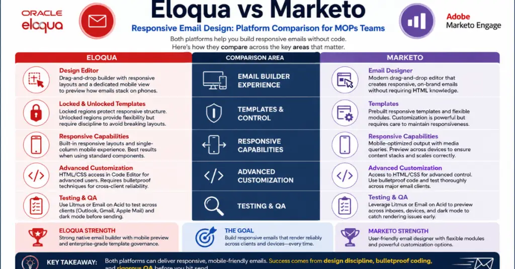
| Consideration | Oracle Eloqua | Adobe Marketo Engage |
|---|---|---|
| Primary builder | Design Editor (drag-and-drop email builder) | Email Designer (new drag-and-drop editor) |
| Responsive output | Responsive layouts and mobile view built in | Responsive templates with a mobile preview |
| Template control | Locked and unlocked template regions | Modules and reusable content blocks |
| Custom HTML | Code content block for hand-coded sections | HTML email templates for full control |
| Where teams get stuck | Gradients, background images, custom buttons | Same rendering traps across inboxes |
Where Responsive Emails Break: The Bulletproof Problem
Both builders produce clean responsive emails until you add the design flourishes that clients love and inboxes hate. This is where the word “bulletproof” enters the vocabulary. A bulletproof element is one built to survive even when an email client refuses to cooperate.
Gradients and Background Images
Email background images and gradients are the most common source of broken designs. Support is inconsistent: email client support for background images sits around ninety percent overall, but the exceptions are the inboxes that matter. Outlook needs a VML fallback, and Gmail can strip the style attribute that holds your background entirely. The safe pattern is to treat the background image as a decorative enhancement and set a solid background color underneath, so the email still reads if the image never loads. Our deep dive on the painful truth about background images in email breaks down the client-by-client support and the fallback pattern in full.
Bulletproof Buttons
Bulletproof buttons are calls to action built with HTML and inline styles rather than a clickable image. The reason is simple: many inboxes block images by default, and a button that is really just an image disappears the moment images are off. A bulletproof button keeps its shape, color, and clickable text even with images disabled, which protects the single most important interaction in the entire email.
The stakes here are not cosmetic. Your button is where a reader becomes a lead, so a button that vanishes is a conversion you will never see and never diagnose. Treating the primary call to action as something that must work in the worst-case inbox, not just the best-case preview, is what separates a design that performs from one that merely looks good in a portfolio.
Eloqua’s Design Editor and Marketo’s new Email Designer both produce responsive emails without hand-coding, but the moment you add gradients, background images, or custom buttons, you must QA every major client before you send.
Mobile-Responsive Marketing Emails: The Rules That Hold Up
Mobile-ready emails succeed on a short list of durable rules, and they hold true no matter which platform you build in. Our older primer on responsive design for mobile email still captures the fundamentals, and they have not changed much because the physics of a small screen have not changed.
- Design in a single column: A single-column layout near 600 pixels wide is the most reliable structure across devices, because it has only one way to stack on a phone.
- Size tap targets for thumbs: Make buttons and links at least 44 by 44 pixels so they are easy to tap without zooming. Cramped links are the fastest way to lose a mobile click.
- Lead with the message, not the hero image: Assume the top image may not load. Put your core value proposition in live text near the top so the email works even before a single graphic renders.
- Keep the file lean: Heavy emails get clipped in Gmail and load slowly on mobile data. Trim unused code and compress images so the message arrives whole.
Why Email QA Is Non-Negotiable
Every technique above shares one dependency: you cannot know it worked until you test it. QA is the discipline of previewing your email across real clients and devices before it goes out, and it is the difference between a design that looks right and one that is right. Our deep dive on email QA testing makes the case that this quiet step is the real safeguard behind every successful send.
What to check every time: Confirm the layout reflows to a single column on mobile, that background images have a solid fallback, that buttons stay clickable with images off, and that links point where they should. If your campaign gates an asset behind one of those links, confirm its access window too — our guide to time-limited PDF access control shows how to expire a gated download link cleanly. AI-assisted testing tools are starting to flag rendering issues automatically, but a human still owns the final look before the email reaches a real inbox.
Bake this into the process, not the person. A shared preview checklist, a required test send to a seed list, and a second set of eyes on anything with a background image or a custom button will catch far more than talent alone. The goal is a send you can trust on the first try, every single time.
Conclusion
Responsive email design is not a checkbox that Eloqua or Marketo ticks for you. Both platforms give you responsive builders and mobile-ready templates, and that gets you most of the way. But the last stretch, where gradients, background images, and buttons meet the reality of Outlook and Gmail, is where practitioners earn their reputation. Build defensively, respect each platform’s terminology, and let QA be the gate rather than an afterthought, and your emails will look intentional in every inbox that matters.
If you want help building a responsive email foundation that holds up across Eloqua and Marketo, contact us at 4Thought Marketing. We help B2B marketing operations teams ship emails that render cleanly and convert consistently.
About 4Thought Marketing
We're a B2B marketing automation and AI consultancy with a thing for getting complex tech to actually work. Since 2008, we've helped hundreds of organizations across financial services, technology, manufacturing, and real estate get more from Eloqua, Marketo, and their CRM integrations. We serve our clients across marketing automation strategy, lead lifecycle, AI, compliance, preference management, and more. Explore our services or get in touch.
Frequently Asked Questions
What is responsive email design?
Responsive email design is an approach that uses CSS media queries to reflow a fixed desktop layout into a single, readable column on smaller screens. It keeps text legible and buttons tappable regardless of the device. Because some inboxes ignore media queries, many teams pair it with a hybrid approach that still looks intentional when the code is stripped.
Does Eloqua create responsive emails automatically?
Largely, yes. The Eloqua Design Editor ships with responsive layouts and a mobile view, so standard components stack correctly on phones without custom code. The exceptions appear when you add gradients, background images, or custom-coded sections, which still need manual testing and fallbacks.
What is different about the Marketo new email editor?
Marketo’s Email Designer is a re-imagined drag-and-drop tool that produces responsive, on-brand emails without HTML knowledge. It provides out-of-the-box templates and requires your subscription to be migrated to Adobe’s identity system. Advanced users can still hand-code HTML templates for full pixel control.
Why do background images and gradients break in some email clients?
Support for CSS background images is inconsistent across inboxes. Outlook requires a VML fallback to display them, and Gmail can remove the style attribute that holds the background entirely. The safe practice is to set a solid background color behind any email background image so the message still reads if the image does not load.
What should a pre-send email check cover?
A thorough QA pass should confirm the layout reflows to a single column on mobile, that background images have a solid color fallback, that bulletproof buttons stay clickable with images disabled, and that every link points to the correct destination. Testing across real clients and devices catches the rendering issues that a single desktop preview will always miss.